Not an artist? You can still make great UX storyboards
It’s all about communication, not art skills
This article is part of an ongoing personal journal, where I talk about my experience taking Google’s UX Professional Certificate on Coursera. This article covers topics discussed in Week 1of Course 3: Build Wireframes and Low Fidelity Prototypes.
So I just finished up week 1 of course 3, which goes over storyboarding and low-fi wireframes.
Storyboarding is easy for me because I’m an artist — and I created a lot of UX storyboards as part of my job when I worked at Intel.
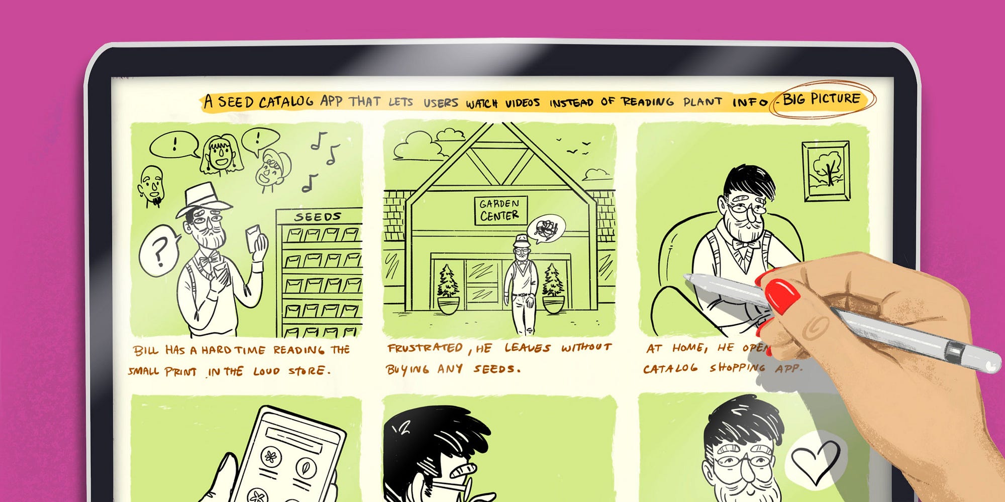
For our Google UX Design Certificate project, we created two different storyboards showing a short interaction with the product we are designing (mine is a seed catalog app) — a “big picture” storyboard showing a user in a setting, focusing on emotion and motivation; and a “close up” storyboard showing the actual interactions with the app screens. Mine shows my persona Bill using the video feature that allows users to watch informational videos instead of reading about products:

Now, my storyboards have a high level of detail because as I mentioned, I am an artist and I know how to draw. The Google UX course only requires a very low level of fidelity for the storyboards — they show examples using stick figures. So you don’t have to have any art skills to complete this section of the course adequately.
However, I thought I could add some tips of my own. After all, I do have some expertise in this particular skill set.
Tips for drawing storyboards
So first of all, I want to go over the goals of a storyboard. The point of creating storyboards isn’t to wow people with your art skills.
Storyboards should inform your audience and clearly demonstrate a situation, event, or interaction.
There are two types of storyboard quality — high fidelity and low fidelity. They are each useful for different situations.
Low-fidelity storyboards are usually quicker sketches. They are useful for explaining things to other designers, or your team members working on the same project. They need to clearly show all the important details, but they don’t have to be “impressive” looking — and most people viewing them will have some idea of the project.
High-fidelity storyboards are useful for getting buy-in from stakeholders who aren’t part of the design team — I did a lot of these at Intel. For example, a manager might need to pitch some ideas to a higher-level executive to get funding or human resources for development. In this case, the storyboards will be part of a presentation and they should have a certain level of sophistication.
I’ll give you some tips for each type!
I also want to note that doing storyboards digitally, even if they are sketches, will help speed up the process a lot. If you have a reoccurring scene or character, why draw it twice? I create my storyboards on my iPad and I copy and paste all the time.
Low fidelity storyboards
Okay so first of all, if you aren’t an artist, you probably have stress about drawing. This is normal! Drawing is a learned skill, like all skills. An artist has an internal library of techniques and concepts that they’ve stored over time. Here’s the thing — you don’t have to know EVERYTHING about how to draw to be able to learn a few effective drawing techniques quickly.
When creating storyboards, your main goal is to tell a story.
When setting out to draw characters, don’t obsess over getting every detail right. You can create effective characters with only a few simple shapes and lines. Like this:

I bet you can tell that’s a person. It’s made up of 4 ovals and 4 lines. Pretty simple! But how to make it look like a specific person?

The characters now look different, even though I only added a few more lines to each. I bet you would have no problem picking them out if I asked you which one was a kid in a baseball cap, which one was a girl, and which one was a business person.
One thing to note: don’t bother to draw hands if you don’t have to. Everyone struggles with hands. Take a page from Animal Crossing’s book and just make them circles, as I did above!
Now, when it comes to faces, keep it simple. It’s more important for your storyboard characters to be expressive than it is to render faces perfectly. The majority of expression comes from the way we use our eyebrows and our mouths. You can use exaggeration to get your point across in storyboards. These simple faces all have distinctive expressions:

When you’re drawing your characters in action, use cartooning techniques — draw in gesture lines. Are they working hard? Draw sweat flying off of them. Running fast? Draw lines coming from the back. Dizzy? Circles around the head with stars… you get the idea.
The same simplicity principles work for drawing animals:

I bet you can name four distinct animals! Each one is made up of a couple of ovals and some lines. The question is, how do you create something that’s very recognizable by using the simplest drawing techniques?
I realized this while playing a game with my family. We were doing one of those team games where have teams — one person has to draw something quickly with a timer running, and the other person guesses. The first team to call the right guess wins. My team almost always wins at this game. What I realized while playing this game is that you don’t need to draw a good or complete picture — you need to draw the simplest, most obvious feature that describes your topic. For instance, the last time I played I had to draw a dog. Instead of drawing a whole dog, I drew an oval for a head, 2 floppy ears, and a tongue hanging out of a mouth — like the dog I drew above. An oval for a head could be any animal — but the combo of floppy ears and hanging tongue is usually only related to one animal — a dog!
The human mind naturally wants to make order out of what we see. Our brain has a huge library of familiar patterns and shapes to draw from. So if you provide the right cues, your audience will fill in the rest.
When you sit down to draw a storyboard, don’t get caught up in worrying about making it perfect. You don’t have to learn how to specifically draw every single item in the world if you use this concept:
Think about breaking it down into the simplest shapes, and then adding the most obvious detail that describes your subject.
This applies to everything. If you want to draw something, look at a reference picture and quickly break it down into its basic elements. Here’s an airplane:
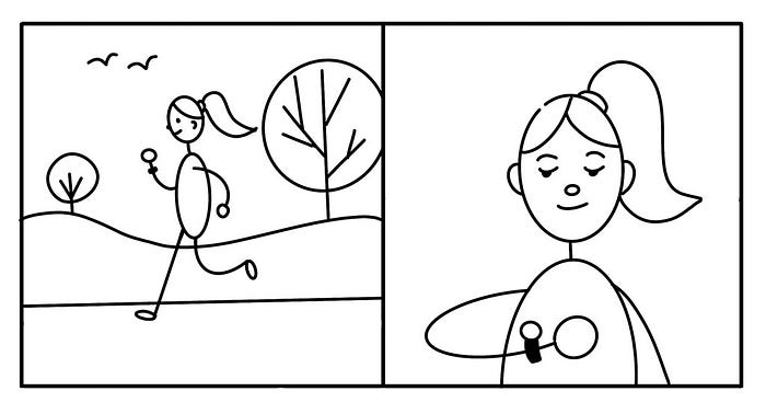
Moving on, your characters need to be set in a scene. You don’t need to draw a detailed scene for every panel. If it’s a close-up of the character, you probably don’t need to have a background. If it’s a panel where the scene is part of the character’s story, then you do. As an example, imagine you’re storyboarding a scene that involves a jogger and a fitness watch. When showing her in action, drawing her outdoors running on a road helps explain the scene. In the closeup, she’s looking at her watch — but no background details are necessary. The audience will infer that she’s still in the outdoor scene. If the scene changes, then draw a new simple background to clue the audience in.
Remembering a few key concepts will help you create recognizable scenes:
- Horizon Line
- Vanishing Point
- Depth Perception
Humans experience the world in 3 dimensions, and artists use these tricks to mimic that experience on a flat, 2D page. There are more advanced techniques for creating 3D perspectives in art, but these basics are enough for simple scenes.
Start drawing a scene by establishing a horizon line. If you draw an imaginary line at the level of your eyes, that’s the horizon line. Anything above the horizon line slopes down towards it, and anything below the horizon line slopes up towards it. Here’s an example:
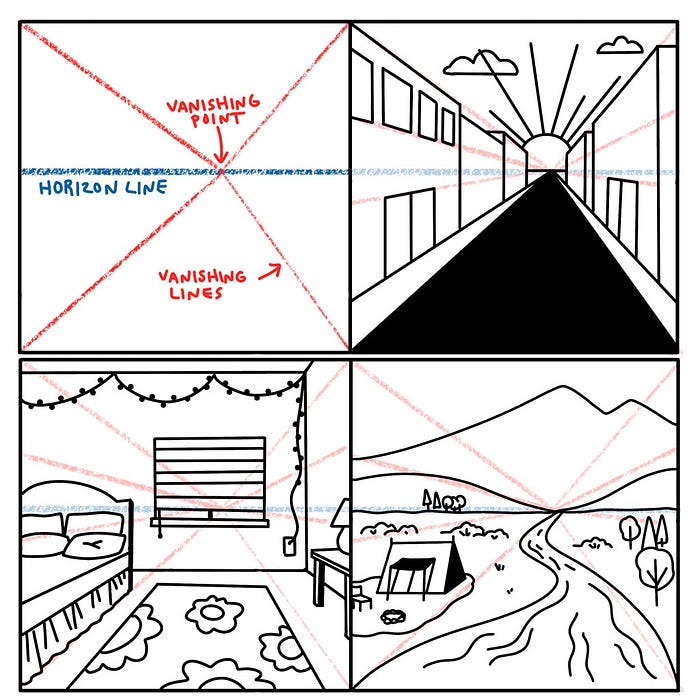
These are the basics of drawing in perspective. You can learn more about perspective drawing if you like. However, as you can see, you can make a variety of convincing scenes just using these tips. This is most useful for drawing scenes with buildings or interior spaces, like the bedroom above. Often, you don’t even need to use them to create a scene. For my storyboard with Bill, it was fast and effective to draw the garden center store from the front view. Go with the easiest way to set the scene!
It’s worth noting that most digital drawing programs have a perspective guide tool!
That brings me to the next topic — Depth Perception.
This one is simple. We see closer things as bigger, and things that are further away as smaller. In my garden center storyboard panel, Bill is shown WAY bigger than the store front doors. We know that Bill is actually smaller than the doors. We can infer that Bill is much closer to us, and that the garden center is some distance behind him in the background.
Another way to use depth is that brighter, lighter colors will come to the front, and darker, more muted colors recede. I use this all the time when I do my storyboards — I’ll typically make the whole background a muted shade and then color just the subject a brighter shade. It draws the audience’s eye immediately to the focus of the panel. You can read a lot more tips about drawing with depth here.
High Fidelity Storyboards
My advice for high-fidelity storyboards is this:
Trace them.
I did this all the time for Intel. These types of storyboards are often needed quickly, and need to show a high level of realism. Instead of taking 8+ hours drawing from scratch, you can work smarter, not harder. Your boss is paying you to produce an effective result, not spend a ton of time creating an artistic masterpiece.
As an example, here are a couple of panels I did for a user flow for a proposed Ikea AR app.

The images I traced for these storyboards were a combination of photos I took of my own house, furniture images downloaded from IKEA, and a stock photo of hands holding an iPad. This enabled me to create a specific, detailed scene with a high level of realisim.
Side note, I did these storyboards for Intel in 2014. They were doing a lot of ideation about how to use the RealSense camera in commercial applications. I guess they didn’t land this contract — IKEA ended up making an AR app like this one with another development partner in 2017.
Here’s another panel where I used a friend as a model and car images:

To make traced storyboards:
- Digitally composite photos — you can take pics of your friends & co-workers, spaces, or scenes. You can also find images online. For instance, I once had to create storyboards of some specific factory equipment. I didn’t have access to a factory, so I found a series of photos online and composited them together.
- Trace the composites digitally.
- Add simple colors to help define the space and draw the eye.
- If you need to create close ups of screen interactions, it’s very easy to composite in a UI design to your drawing.
So those are my tips for creating storyboards! I hope they are helpful. I have a lot of knowledge about the subject and it’s incredibly hard to break it up into succinct, helpful advice that’s not too complicated. I’d be happy to answer any questions you might have!
Cheers, Rachel

